

In the early 20th century the fast growing city of Birmingham developed a new standard design for it's street name plates. The design was similar to the octagonal signs of before though was more elaborate with fleur-de-lis at each end. The typeface used was Baskerville Print which had been designed by Birmingham printer John Baskerville.
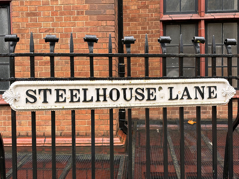
Steelhouse Lane, Birmingham
The signs were used throughout the city and can be seen in many places with pre-Second World War housing. The oldest signs just had the street or road name on them though some later signs also included the postcode after Birmingham introduced them in the 1930s.
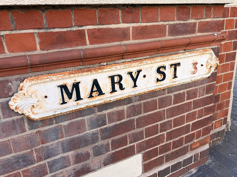
Mary Street, Jewellery Quarter
An interesting variation on the signs is with abbreviations. Words like "road" and "street" are shortened on some signs though written in full on others even though there is little actual difference in the length of the sign! Even how the abbreviation was made could vary. Signs were either wall mounted or in many cases mounted on an elaborate metal stand as shown.
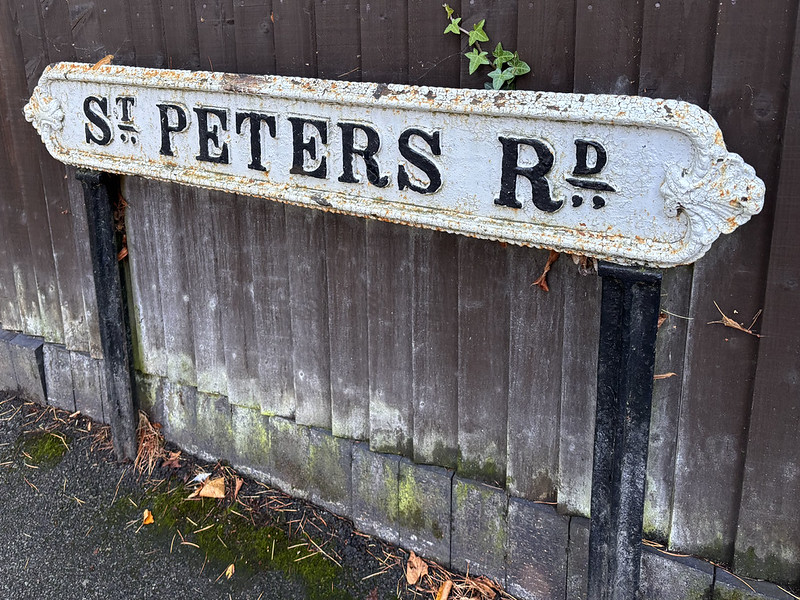
St Peters Road, Harborne
Postcodes began to appear on street signs in the 1930s as the system was rolled out across Birmingham by the Post Office. The postcode number (no need to put B on there of course, people should know what city they were in - well you would hope so anyway) was added after the street name. In red usually but sometimes in black.
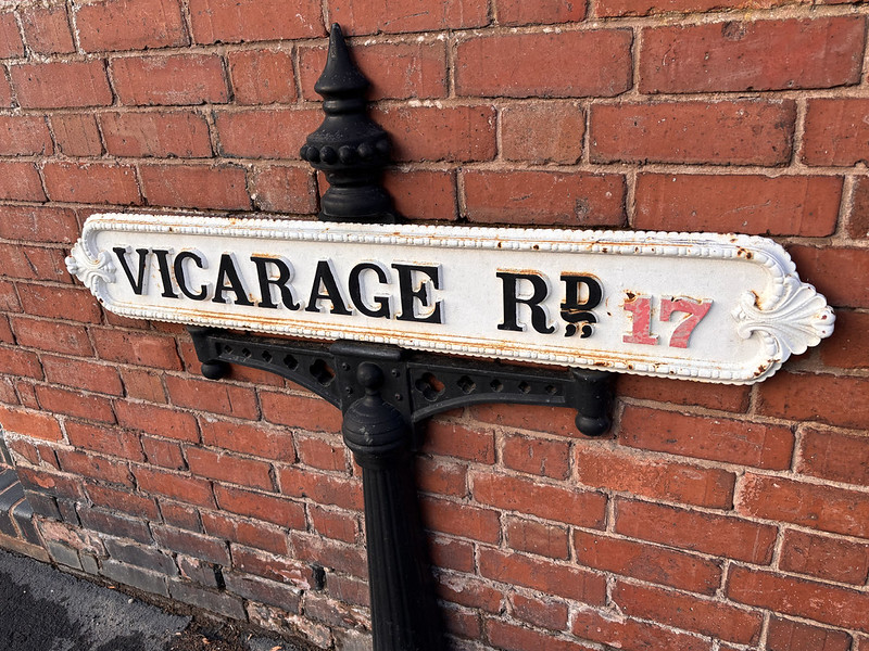
Vicarage Road, Harborne
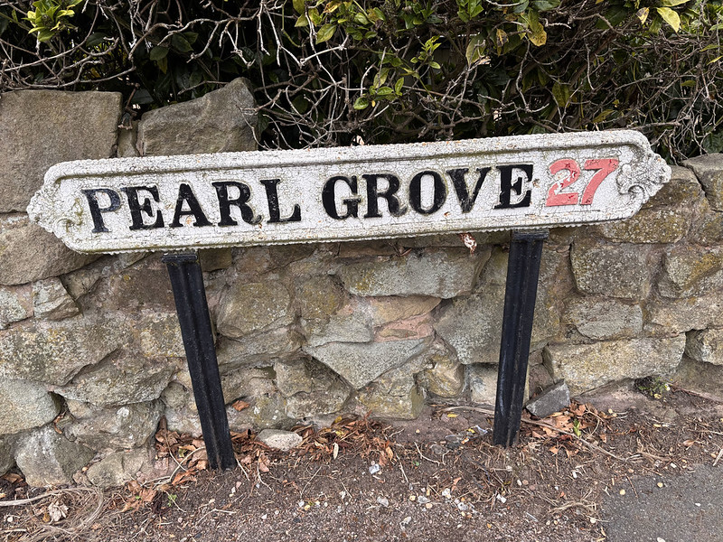
Pearl Grove, Quinton
As there was not enough space on the sign for extra information such as the road being a cul-de-sac, this was added as a smaller plate underneath the main street name.
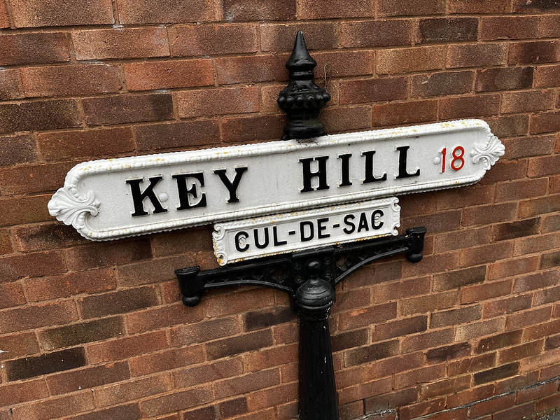
Key Hill, Jewellery Quarter